The Quiet Mutiny Inside Disney's Ink Department
Animation Obsessive's deep dive into the visual design of One Hundred and One Dalmatians tells a story that goes well beyond aesthetic choices. It is, at its core, a story about institutional rebellion — how a handful of artists smuggled modernism into Walt Disney's studio while the boss was looking elsewhere, and what it cost them when he finally noticed.
The article traces Ken Anderson's role as the film's art director and principal agitator. Anderson, a veteran dating back to Snow White, saw an opportunity in the late 1950s. Walt Disney had spread himself thin across live-action films, television, and Disneyland. His attention to animation had slackened. Anderson pushed hard for a unified, graphic style that broke decisively with Disney's decades-long quest to make animation look like something other than drawings. As the article recounts, Disney's philosophy had always been blunt on this point:
[Walt] hated to see a drawing on a screen. He wanted to see them disguised ... he was the one who really pushed us into cel-paint ink lines, where the ink line is the same color as the area it is encompassing.
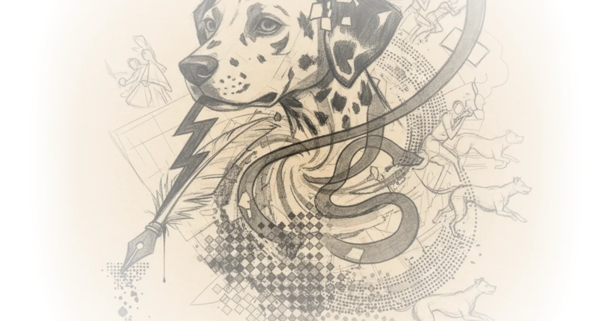
Anderson's Dalmatians was the precise opposite. Scraggly lines, visible brushwork, color that refused to stay inside its borders. Every frame announced itself as a drawing. The irony is rich: the studio's greatest commercial success of the era was built on exactly the aesthetic its founder detested.
Xerox as Trojan Horse
One of the article's sharpest insights concerns the Xerox process. On the surface, Xerox was a cost-cutting measure — it automated the transfer of animators' pencil drawings to cel, eliminating the skilled inking department that had painstakingly traced and refined those lines for decades. But Anderson weaponized it. By skipping the inking stage, the animators' raw, imperfect linework went straight to screen. Anderson was characteristically unapologetic:
There was no attempt to disguise the lines; I knew they were going to be a half foot across on a big screen, but they were good-looking lines, and [because] they were the animators' lines, they always had more life than tracings.
This is a fascinating case of technology enabling aesthetic revolution rather than causing it. Anderson did not adopt Xerox because it happened to produce a modern look. He chose it because it advanced a visual agenda he had already committed to. The technology served the art, not the other way around — a sequence of cause and effect that gets reversed more often than not in accounts of animation history.
The Background Problem
Perhaps the most technically revealing section of the article concerns the backgrounds. Anderson's team used a two-layer system: a loose painting underneath, with a line drawing Xeroxed onto a cel overlay placed on top. The initial results were dismal. Layout artist Ray Aragon recalled that early tests "looked like a cheap comic book." The breakthrough came from Walt Peregoy, who borrowed the approach of painter Raoul Dufy — painting loosely, ignoring where the lines would eventually fall, and trusting that the overlay would snap everything into coherence.
What makes this technique remarkable is the deliberate imperfection built into it. Aragon's description of the layout process reveals a paradox at the heart of the film's charm:
Once we did that and the thing was scientifically perfect, it was too perfect. We had to put a clean sheet of paper over that and do the whole thing over by hand without the use of triangles and rulers. We had to now draw over the rulers and make a finished drawing by hand as carefully as we could, to make it not so perfect. That is where you got the charm of the drawings of One Hundred and One Dalmatians.
The artists first drafted geometrically precise perspective layouts, then traced over them freehand to reintroduce human wobble. Precision existed to be selectively destroyed. This is craftsmanship of a high order, and it complicates the common assumption that modern graphic styles are somehow easier or lazier than Disney's classical realism. The Dalmatians team worked twice — once for accuracy, once for personality.
Credit and Its Discontents
The article is commendably honest about the politics of authorship. Bill Peet, who wrote and storyboarded the film, later complained that animators took "credit for my Cruella de Vil and all of the personalities." Animation Obsessive handles this with appropriate nuance, noting that Peet's grievance was "partly true and partly bitterness." The film was, as Cartoon Modern put it, "a graphic collaboration between numerous artists" — Anderson set the overall direction, Peregoy defined the color approach, Peet shaped the characters and narrative, Tom Oreb and Milt Kahl refined character designs, and so on.
There is a counterpoint worth raising here. The collaborative nature of the achievement makes Anderson's subsequent punishment all the more unjust. He bore the consequences for a collective decision. Disney gave him a year-long silent treatment, multiple demotions, and public humiliation. Anderson recalled Disney saying at one meeting, with Anderson present:
We're never gonna do another one of those goddamned things like Ken did.
The studio's most commercially successful animated film in years — and its art director was treated like a saboteur. It is hard not to read this as the reaction of a man who felt he had lost control of his own studio, punishing the most visible symbol of that loss rather than confronting the structural reality that his attention had drifted elsewhere.
A Modernism That Died Young
The article's most sobering observation is how quickly the experiment was shut down. The Sword in the Stone (1963), just two years later, retreated to conservative ground. Even Walt Peregoy's work was reined in. Animation Obsessive calls Dalmatians "the culmination of the Disney studio's drive toward modernism," but culmination is perhaps too generous a word. It was more like a peak immediately followed by a cliff. The studio would not attempt anything comparably bold for roughly three decades.
This raises a question the article touches but does not quite answer: was the modernist Disney film a viable path, or was Dalmatians necessarily a one-off? The commercial success suggests viability. The audience did not reject the graphic style — they made it the studio's biggest hit. But Disney's personal taste, and the institutional conservatism that survived him, ensured the experiment was not repeated. The UPA-influenced movement that Anderson, Peregoy, and their collaborators channeled was already fading by the early 1960s. Without Disney's blessing, no one at the studio had the authority to sustain it.
What remains striking is how good the film still looks. Most Disney features of the late 1950s and 1960s have dated in ways that Dalmatians has not. Its graphic boldness reads as contemporary in a way that the softer, more painterly approach of its neighbors does not. The artists who made it understood something their boss refused to accept: that showing the drawing, rather than hiding it, could produce a deeper kind of life.
Bottom Line
Animation Obsessive delivers a meticulously sourced account of how One Hundred and One Dalmatians became Disney's accidental modernist masterpiece. The article is strongest when it traces the specific technical innovations — the Xerox process, the two-layer backgrounds, the deliberate imperfection of the layouts — that gave the film its distinctive character. It is also refreshingly candid about the human cost: Ken Anderson paid dearly for pushing the studio forward, even as the audience rewarded the result. The piece makes a compelling case that Dalmatians was not just a stylistic departure but a genuine inflection point — one the studio chose to ignore for decades. Anyone interested in animation history, or in how institutions resist their own best instincts, will find it worth the read.