", Most AI-generated websites look depressingly similar. The secret weapon to fix this? Animation.
Chase argues that adding motion to your landing page is one of the simplest high-leverage techniques available — dead simple to implement, but it gives your site a visual "wow factor" that 99% of AI-built sites simply lack.
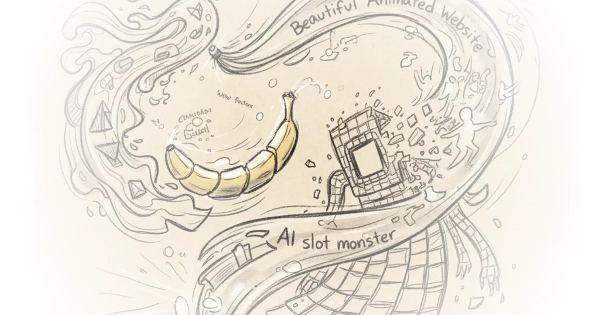
The Image Generation Challenge
The first step requires creating a starting image inside Nano Banana Pro. This becomes both the opening frame for your video and the fallback image for mobile users who can't load video content.
When crafting prompts, consider feeding the AI reference images alongside text descriptions. MidJourney works well for finding style inspiration — you can search different art styles and adapt them to your vision. Pinterest is another solid option.
The key insight: don't create images in a vacuum. Before generating anything, have a clear mental picture of what your final landing page should look like. Browse Dribbble or Godly for landing page references, then use those as prompts for Nano Banana Pro. The more context you give the AI about your endgame vision, the better results you'll get.
Expect to iterate. Getting exactly what you want will likely take several tries.
Creating the Video
Once you have your image, turn it into video using Clling or VO — both accept a starting frame and can generate motion from it.
The prompt here is straightforward: keep it static with extremely slow, subtle movement. Less is more. If your animation steals attention from your actual content, it's tacky. The goal is tasteful accentuation, not spectacle.
On video length, there's an interesting debate:
A 15-second clip gives you maximum creative freedom but creates a visible "stutter" when it loops. A 5-second loop requires ffmpeg to reverse the second half and stitch it — technically elegant but constrains your creative options.
Critics might note that nobody sits on a hero section for 15 seconds. Users scroll within a few seconds. The longer video is simpler to implement, though arguably less practical for actual user behavior.
Building the Landing Page
After downloading both image and video, open Claude Code in a new project folder containing those assets.
The minimal prompt works like this: "I want to create a landing page for my AI agency. Use the MP4 file in the folder to create an animated hero section. Use the still image to replace the video for mobile users."
For more sophisticated results, use the UIUX Pro Max skill — it translates industry-specific design knowledge into appropriate website structures.
The most important tip: give Claude Code examples of websites you like. Screenshots work well. More context upfront means less iteration later and dramatically less generic output.
Deployment
To get your site live:
Push your code to GitHub (free, can be public or private). Then import the repository into Verscell — their generous free tier makes this accessible. Once deployed, you'll have a live URL you can edit later if you want a custom domain.
"This is where you give Claude Code your examples of websites you like... the more context you give it now, the less iteration you're going to have to do down the line."
Bottom Line
Chase's core argument is solid: animation is the simplest differentiator for AI-generated sites. The technique is genuinely accessible and delivers immediate visual impact.
The vulnerability? Practical usage patterns don't align with longer videos — users scroll quickly, making 15-second hero sections less realistic than they appear in tutorials. The shorter looping approach works better technically but constrains creative freedom. This tension between ideal process and actual user behavior is the most honest part of the piece.